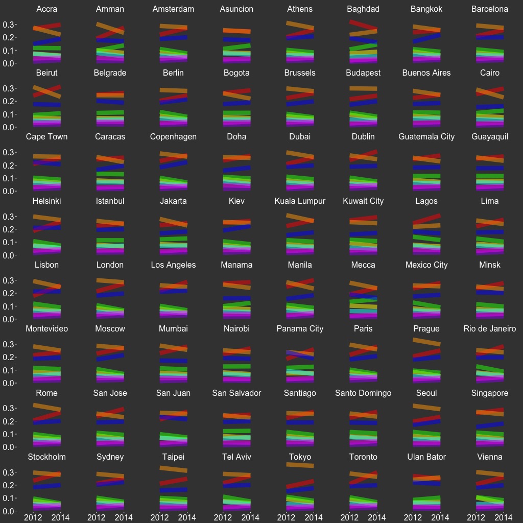
Global Hue
| CODE: |
GitHub |
| DATATYPE: |
image slices |
| SOURCE: |
Twitter |
| YEARS: |
2012, 2014 |
| SIZE: |
32,860,914 |
| SUBSET: |
top 64 cities |
| VIZTYPE: |
glyph slopegraph |
| FEATURES: |
hue |
| FEAT SRC: |
scikit-learn |
| PROJECT: |
Visual Earth |
This is a glyph slopegraph that depicts the change between 2012 and 2014 across eight hue bins of Twitter image slices from 64 global cities. The hue of each line represents the hue of slices in that bin. We see that red has increased and orange has decreased over time.