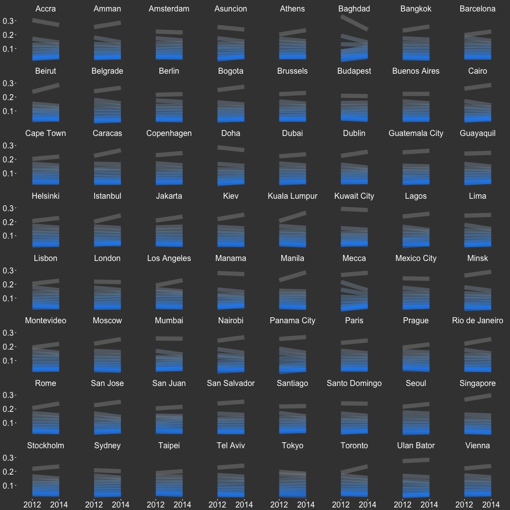
Global Saturation
| CODE: |
GitHub |
| DATATYPE: |
image slices |
| SOURCE: |
Twitter |
| YEARS: |
2012, 2014 |
| SIZE: |
32,860,914 |
| SUBSET: |
top 64 cities |
| VIZTYPE: |
glyph slopegraph |
| FEATURES: |
saturation |
| FEAT SRC: |
numpy |
| PROJECT: |
Visual Earth |
This is a glyph slopegraph that depicts the change between 2012 and 2014 across ten saturation bins of Twitter image slices from 64 global cities. The saturation of each line represents the saturation of slices in that bin. There is little change over time, although we can see that desaturated slices predominate.