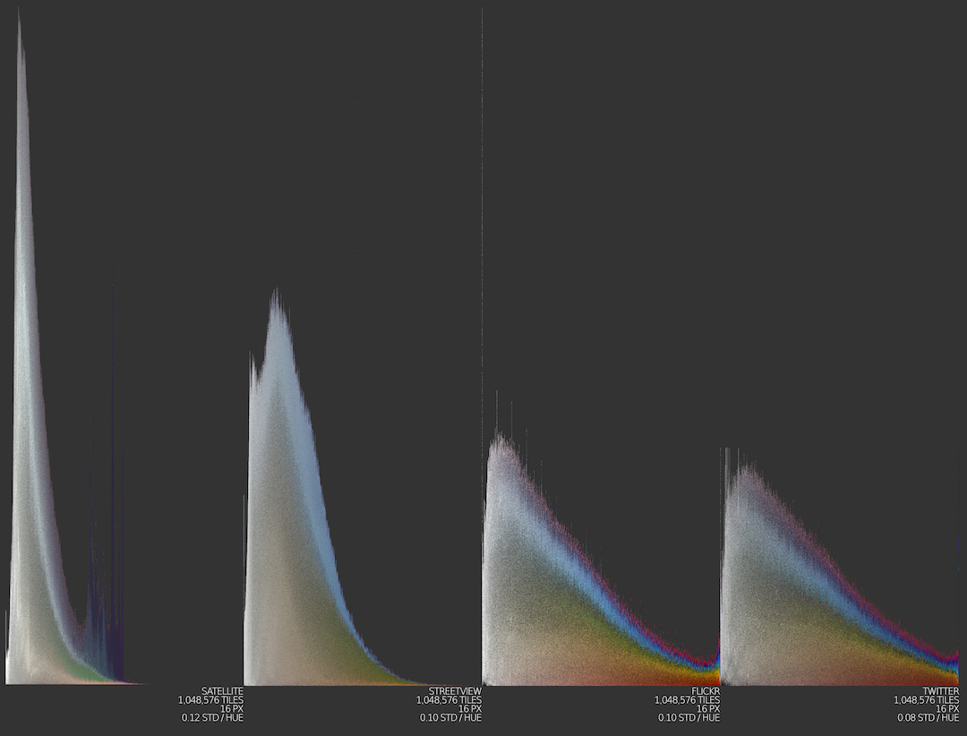
Slice histograms from four different types of image data—shown below—all originating in downtown San Diego. Twitter and Flickr images have a much greater share of saturated reds and magentas than do “natural” images, suggesting that the cultural curation of visual information is in part a selection— deliberate or not—of visual properties rarely found in the natural world.
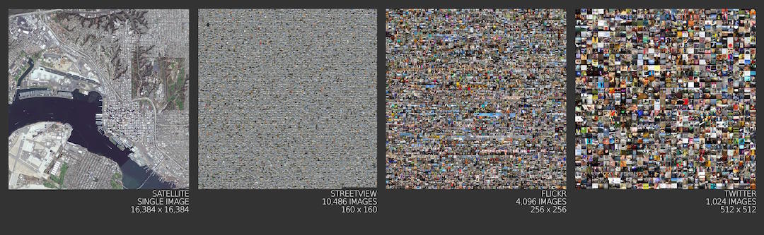
Sources of image data used in slice histograms above, shown here as simple rectangular montages.
Slice Histogram
The slice histogram is a variant of an image histogram that uses small slices of images as plot elements. Image histograms organize images into histogram bins to reveal patterns in image datasets. If whole images are used, however, it can be difficult to see clearly the population statistics for basic visual properties like hue, saturation, and brightness. The slice histogram helps to solve this problem by slicing images into visually homogeneous parts and using the parts as histogram elements. Slice histograms can be used to compare the basic visual properties of different sources of image data, as shown above. Slice histograms were used by Peter Leonard and Lindsay King in their
Robots Reading Vogue project.
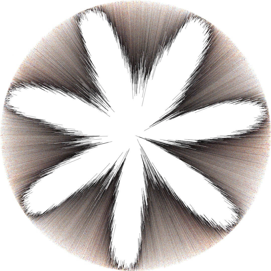
A polar histogram of slices of images posted to Twitter in London, 2014. Slices are arranged by time of week on the angular axis, and brightness on the radial axis. Quite obvious from this plot is the weekly rhythm of tweeting in the city, with a distinct peak and trough for each of the seven days. Although this plot has a quite black and white look, sorting choices can make a big difference, as illustrated below.
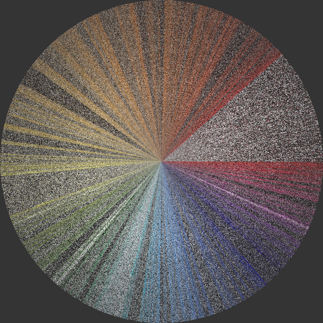
A “flat” polar histogram using the very same data as above. Slices are sorted by hue on the angular axis, and bin heights are made equivalent. Although the data is the same—and all of it visible, as before—the analytical possibilities are very different.

