
Zoom detail of a glyph histogram of risk scores assigned by our model to police officers. The brightness of the center square of each glyph encodes the primary variable, and the saturations of the surrounding four squares encode secondary variables. Hatching indicates missing data. As we move from left to right—and risk scores increase—there is less missing data, brighter center squares, a greater share of bright red, and a somewhat lesser share of bright yellow.
Wintour: Visualizing Predictive Models
The recent spread of machine learning methods into critical decision-making,
especially in public policy domains, has necessitated a
focus on their intelligibility and transparency. The literature on
intelligibility in machine learning offers a range of methods for
identifying model variables important for making predictions, but
measures of predictor importance may be poorly understood by
human users, leaving the crucial matter unexplained—viz., why the
predictor in question is important. There is a critical need for tools
that can interpret predictor importances in such a way as to help users
understand, trust, and take action on model predictions. We describe
a prototype system for achieving these goals and discuss a particular
use case—early intervention systems for police departments, which
model officers' risk of having “adverse incidents” with the public.
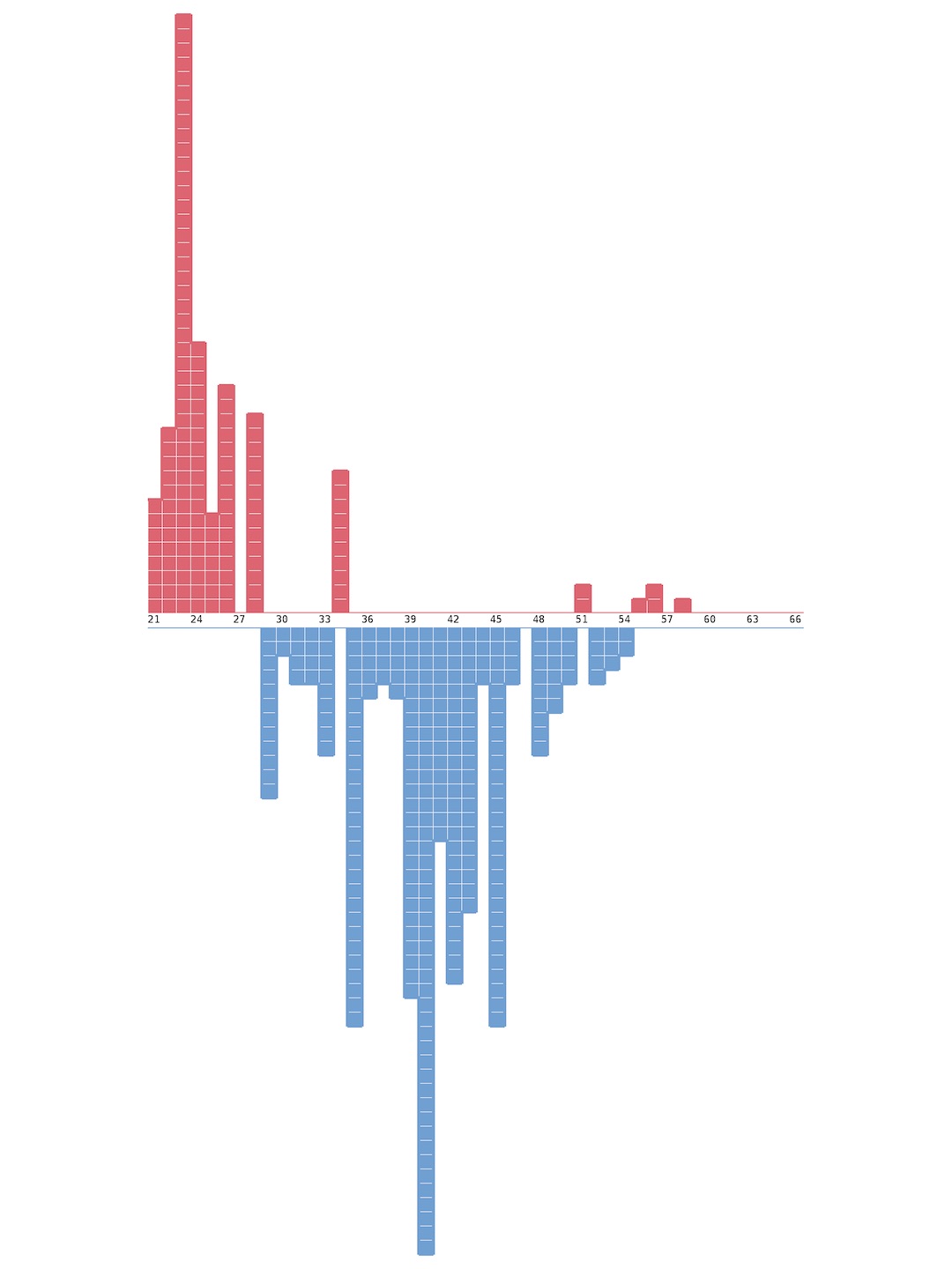
This is a lift-pull plot of officer age. Lift-pull plots show the binwise deviation from the global ratio of positive to negative examples in a training or test set. If a bin has considerable lift, officers in that bin are disproportionately high risk. If a bin has considerable pull, they are disproportionately low risk. Lift-pull plots offer a concise look at the degree to which a given feature helps the model distinguish between classes. We can see that older officers tend to be lower risk than younger officers.
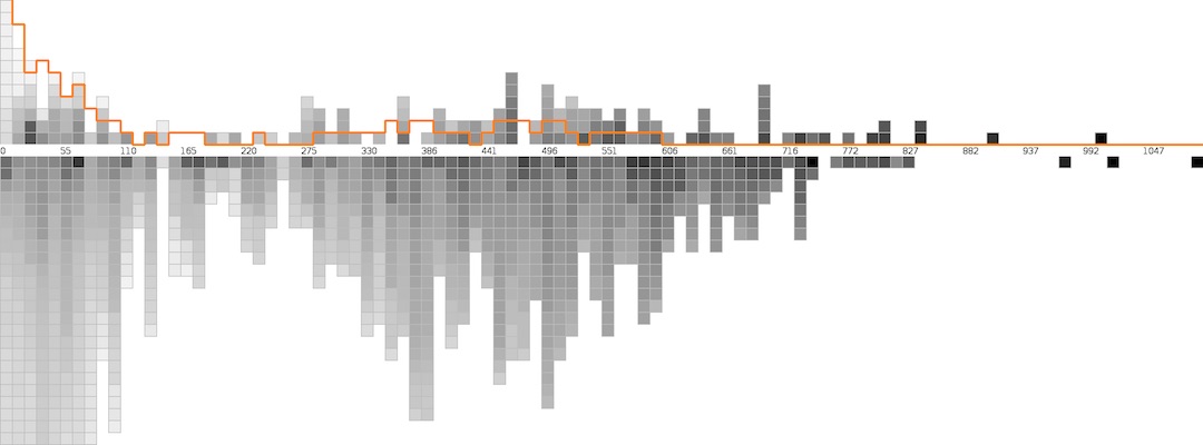
Positive (above) and negative (below, cropped) test set distributions on the variable civilian-initiated dispatches. Glyph brightness encodes modeled risk, ascending from white to black. Orange line traces negative distribution scaled by global positive-negative ratio. For middle and high values of the variable, officers are proportionately more likely to have had an adverse incident, which explains why this variable is correlated with high risk. However, the visualization also reveals that there are high risk officers with very low values for the variable. During interactive use, the user can select individual officers to discover which variables are most important in determining their level of risk and to see where they fall on the distributions of these and other variables.

